For this particular project, my focus is on developing software for a gaming mouse, taking inspiration from the synapse software created by Razer. The decision to work on this software stems from my own experiences while using the application - I found it to be complicated and challenging to navigate. Thus, I have taken it upon myself to create a more intuitive and user-friendly version of the software.
In preparation for this assessment, I conducted extensive research on comparable software such as Ventus Ambidextrous Gaming Mouse, Logitech Gaming Software, Corsair Software, and CM Storm application. My objective was to identify commonalities among these applications and utilize them in my project. Through my research, I found that key binds, game-specific profiles, and calibration were consistently present across all the software. As a result, I have opted to incorporate these features in my assessment.
Upon examining other software options such as Ventus and CM Storm, it became apparent that these applications had notable drawbacks in their design. Ventus utilized bright colors that proved to be excessively luminous, rendering it impractical for usage in dark environments. Meanwhile, CM Storm's software contained an abundance of numerical values that may be overwhelming to users without an understanding of their purpose.
To address these concerns, I have opted for a minimalist design approach in my wireframe, utilizing a straightforward and simple interface. By adopting this approach, I aim to provide users with a more accessible and user-friendly experience.
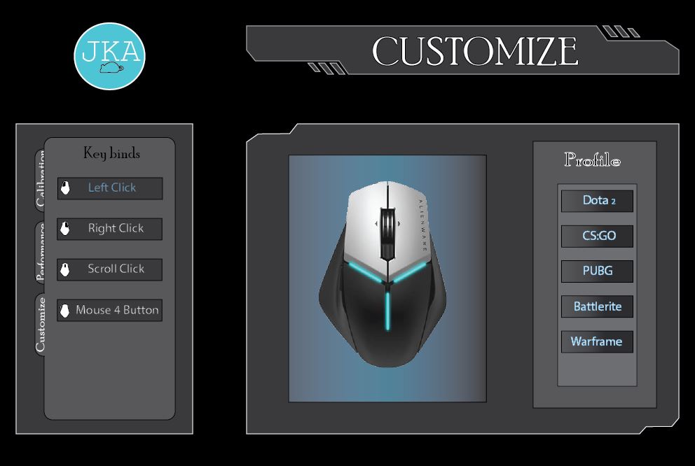
In my pursuit of a distinct design for the mouse software, I opted to create a logo for my company. I was drawn to the futuristic aesthetic of the Avengers logo, which I believed would be well-suited for my own software design given its focus on technology.
However, I soon discovered that the Avengers logo was comprised of only one letter, whereas my company name consisted of three letters. Attempting to fit all three letters into a circular design, akin to the Avengers logo, would have resulted in a cluttered and impractical visual.
As a result, I decided to abandon this approach and instead crafted an original logo design that better suited my company's unique branding requirements.
I made the logo light blue to contrast with the color of the light coming from the mouse, I made sure to color the whole circle light blue and made the colour dominating to establish the main colour of the company. I also use a darker colour as a background of the mouse image because I dont want to end up looking like Ventus. I also used lighter blue for the profile on my main page to contrast with the Heading (Profile) as it would relate to them. I also used the same touch of colour for my bar on the second page and the third page to show that they are all related to the logo. On the Calibration page, I made the border of the box light blue because it doesn't look that much related to the logo with just the blue bar in it unlike the main page that has the letters as blue and the performance page that has two bars in it. I also went for grey and black colour as background because its very easy to look at.
To ensure that my logo stood out effectively, I opted to color it light blue in contrast to the color of the light emanating from the mouse. I ensured that the entirety of the circle was colored in light blue to establish it as the main color of the company.
In order to prevent the design from appearing too similar to the Ventus software, I utilized a darker color as a background for the mouse image. I also incorporated a lighter shade of blue on the profile page, in contrast to the heading "Profile", to reinforce the visual relationship between the two.
Furthermore, I used a consistent touch of light blue on the bar of the second and third pages to demonstrate that they are all linked to the logo. When designing the calibration page, I incorporated a light blue border around the box, as the blue bar alone did not seem to sufficiently relate to the logo. Additionally, I chose to use grey and black as background colors, as they are easy on the eyes and do not detract from the overall design.
To create the mouse image, I utilized Photoshop to copy a mouse from the internet and selected it using the wand tool. After cutting the image, I pasted it into a new file, ensuring that the background was transparent, and saved it as a PNG file to preserve its transparency. Next, I imported it into Illustrator and positioned it at the top of the layers.
For the smaller mouse image on the key binds, I created a rectangle that was almost as large as the mouse image and added anchor points to follow the border of the mouse and imitate its shape. The rectangle was then filled with white so that any button could be highlighted using black for contrast.
Initially, the page title was a plain rectangle, which I found uninteresting. I attempted to improve its appearance by cutting some of the sides, but this resulted in an unusual shape that was unsuitable for a title. To make it more visually appealing, I added three small slanted rectangles that created contrast and repeated the shape found in the logo. For the majority of the text on the page, I used the font "Poor Richard" as it provided clean and well-defined strokes for each letter while also appearing simple and slightly futuristic.
To create a more rounded and polished look for my software, I opted to use rounded rectangle tabs instead of the usual boxy ones. Additionally, I matched the color of the slide bar to the logo to create a consistent and cohesive visual theme. This helped avoid overwhelming the software with too much color, while also establishing a connection to the company's branding. As the slide bar is a thin line, it does not detract from the overall appearance of the software.
In designing the button, the original plan was to use the main color of the company as its background but it was deemed too overwhelming for the software, so it was decided to leave it in plain grey. As for the background of each profile, a gradient of black and grey was used to complement the background of the box and the software itself. However, this was not applied to the KEY BINDS button as it would make every button appear shiny and metallic. The contrast between the background of the KEY BINDS button and the color of the font was preferred.